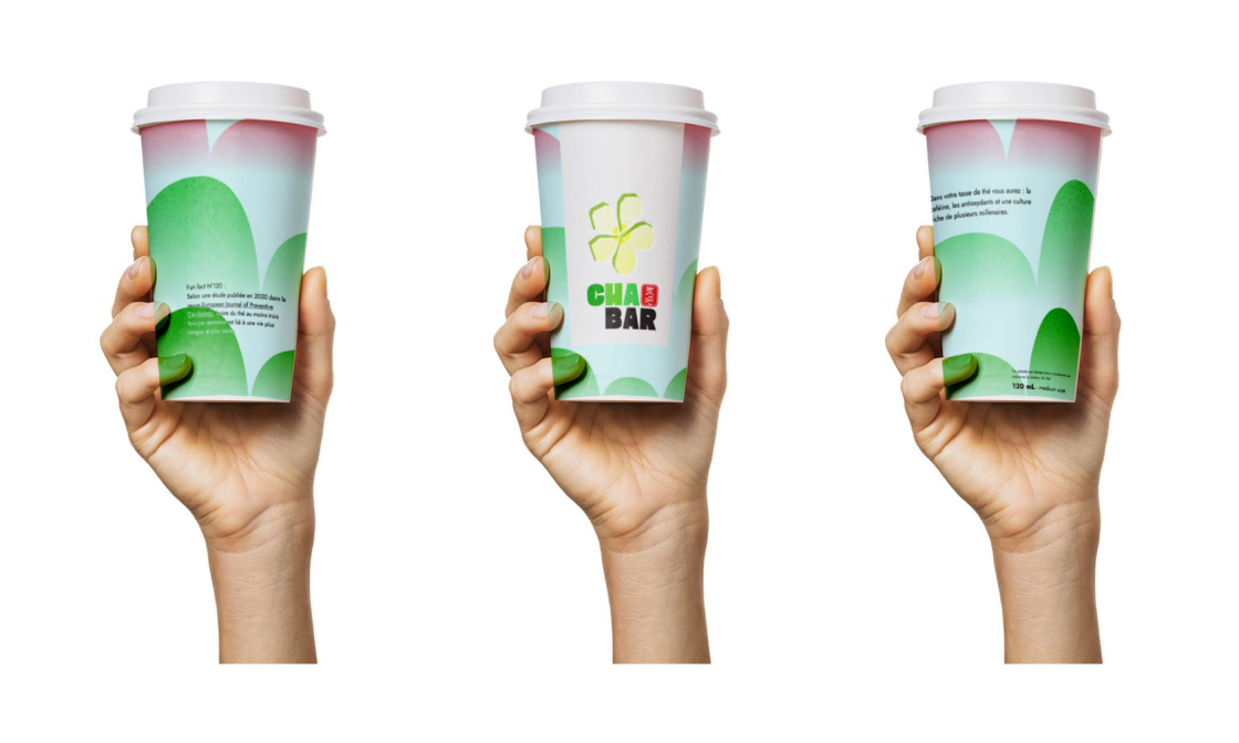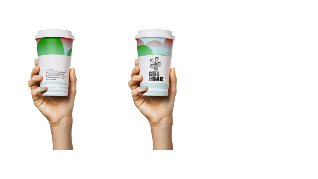
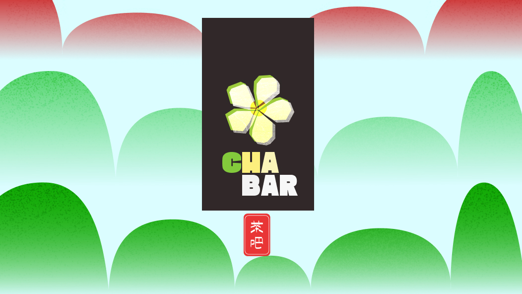
Cha Bar is a brand creation case study for a new tea bar specialised in chinese high quality tea in Lyon. The message : 'Enjoy healthy, revitalizing & tasty high quality tea, no need for morning coffee anymore !'
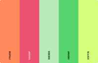
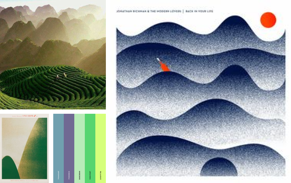
I started with a little research on chinese tea (+little benchmark) and defining a moodboard. The ambiance would be fresh pastel colors, green and yellow mimicking the sun shining on the tea fields.
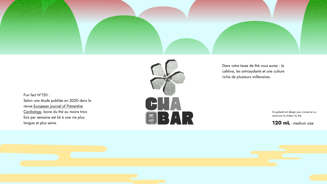
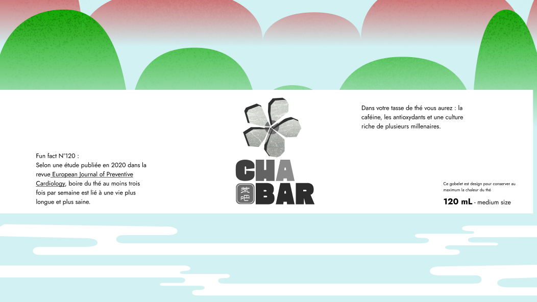
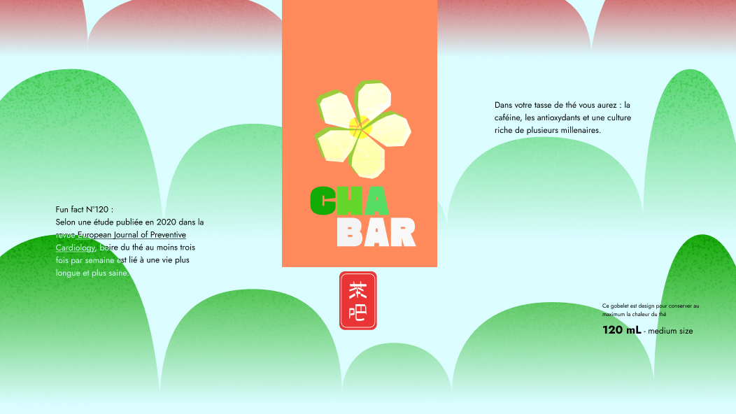
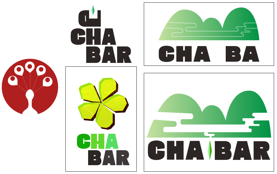
I started testing logos and colors with the colors on the moodboard and bold modern fonts to keep a modern direction.
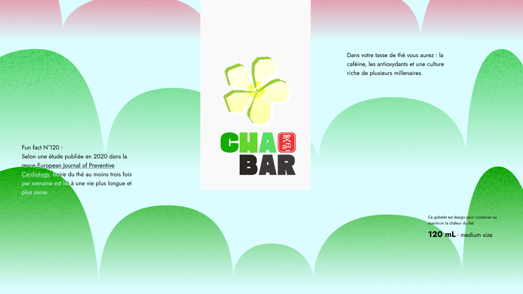
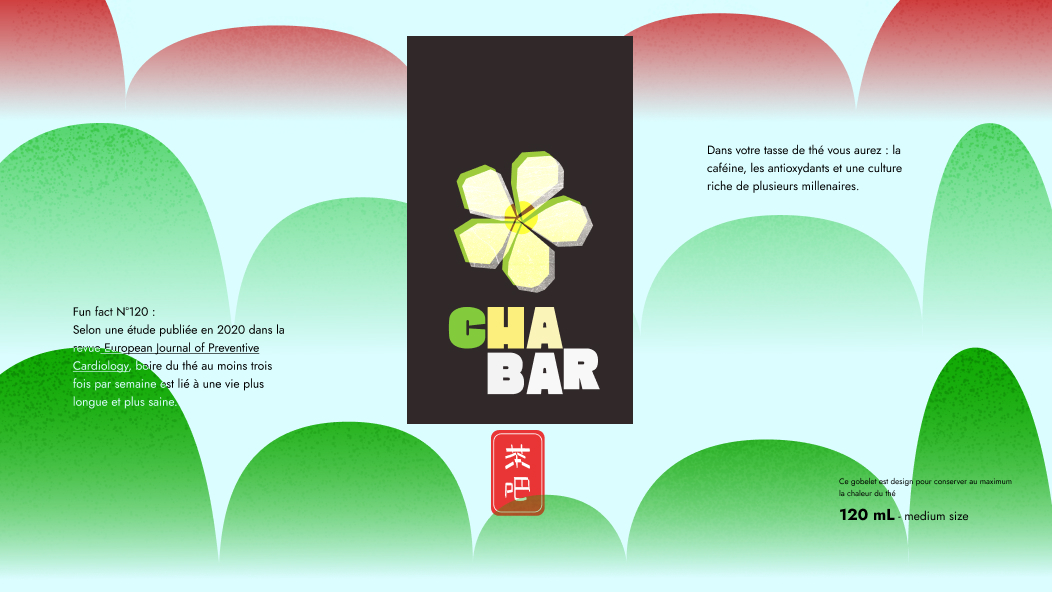
I then tried to visualize with a few mockups and tests of key visuals for cups
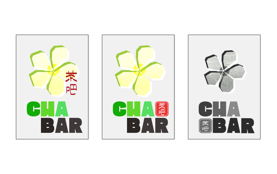
and finally landed on a few assets that would be my client suggestion. <secretly want to serigraph it on a shirt>
